
What Killed Batting Average
K%, Fly Balls, and Better Pitching — A Data-Driven Attribution Study
The launch angle revolution gave us a compelling villain for the death of batting average. Fly balls. Elevation. Sell-out swings. The story fit neatly: MLB told hitters to elevate the ball, hitters complied, and batting averages paid the price.
We went in expecting to prove that story. The data had other ideas.
The Decline Is Real — and Older Than You Think
Let's establish the baseline before we start pointing fingers.
From 1990 to 2024, MLB batting average fell from .258 to .243 — 15 points. The slide wasn't sudden. It wasn't caused by one rule change or one era. It's been grinding lower for 35 years, with one notable interruption: the Steroid Era, roughly 1994–2004, when offense briefly climbed back before the correction hit hard.
The dramatic part isn't the absolute number — it's the pace. Since 2015, when Statcast arrived and the launch angle revolution began in earnest, batting average has stayed glued below .250. We recorded .243 in both 2022 and 2024. The floor dropped.
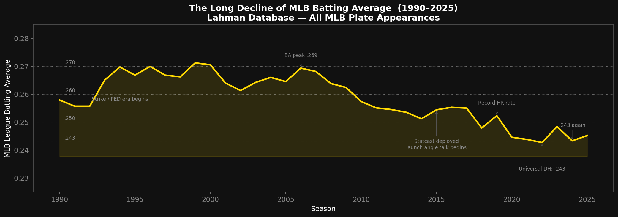
League batting average 1990–2025, annotated with key era transitions. Source: Lahman Database — full MLB population.
The Real Culprit: Strikeout Rate
Here is where the data stops being polite.
We ran a multiple regression: League BA ~ K% + Fly Ball %, covering 24 seasons from 2002 through 2026. The model explains 85% of the variation in batting average (R² = 0.850). That's an astonishingly clean fit for a noisy sport.
But the coefficient breakdown is the real story:
- K% standardized beta: −0.924 — highly significant (p < 0.001)
- FB% standardized beta: +0.025 — not significant (p = 0.77)
Read that again. When you control for strikeout rate, fly ball percentage explains essentially nothing about the batting average decline at the league level.
The league strikeout rate alone carries an r = −0.922 against batting average. That's not a correlation — that's nearly a deterministic relationship. The single most predictive number for what MLB batting average will be in a given season is: how often are hitters striking out?
From 1990 to 2024, K% went from 16.7% to 25.2% — an increase of 8.5 percentage points. That's not noise. That's a structural shift in how the game is played.
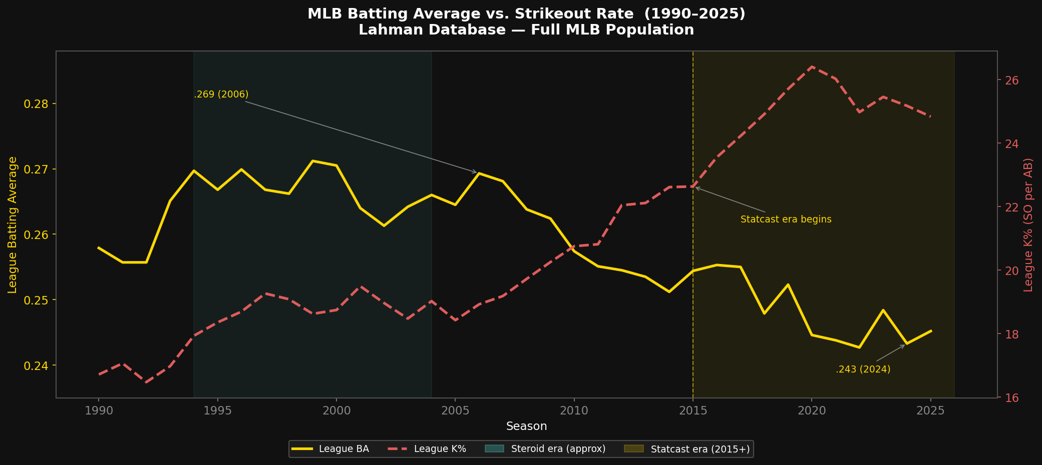
Dual-axis: league batting average (gold) and K% (red) from 1990–2025. The inverse relationship is tight across the full period. Source: Lahman Database.
The 2015 Inflection: When the Two-Strike Rules Changed
K% wasn't just rising before the launch angle era — it was rising at a specific, measurable speed. What happened in 2015 wasn't the start of the trend. It was a gear shift.
| Era | K% Slope | What drove it |
|---|---|---|
| 2005–2011 | +0.43 ppts/yr | Gradual — bigger rosters, more relievers |
| 2012–2014 | +0.29 ppts/yr | Analytics movement valued contact/BABIP — relatively flat |
| 2015–2020 | +0.74 ppts/yr | Launch angle era — 1.7× acceleration |
| 2021–2025 | −0.22 ppts/yr | Rules changes, shift ban — actually reversed |
The 2012–2014 plateau is underappreciated. That was the Moneyball era in full swing — front offices had learned that on-base percentage and contact rates were undervalued, and they were coaching accordingly. The strikeout machine was briefly contained.
Then Statcast arrived. Exit velocity. Launch angle. Barrel rate. And with it, a new coaching philosophy that explicitly told hitters to stop shortening up with two strikes. Maintain your swing. Never concede your mechanics for contact.
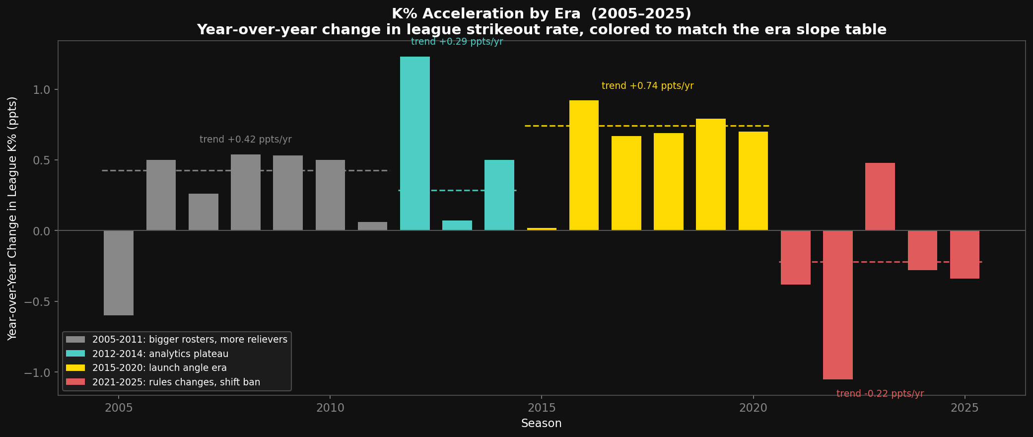
Annual change in league strikeout rate, colored by era. The launch angle era (gold) shows consistently larger jumps than the analytics era (teal) that preceded it. Source: Lahman Database.
The swinging strike rate — how often a pitch results in a swing-and-miss — rose 1.9× faster after 2015 than before. But the most revealing number is Z-Contact%: contact rate on pitches in the strike zone. These are the pitches hitters are supposed to be hitting. In 2007, at the peak contact era, elite hitters made contact on 89.6% of zone pitches. By 2020, that was 84.9% — a 4.7-point drop.
That gap isn't pitchers throwing unhittable strikes. That's hitters swinging through pitches they used to put in play, because they've been coached not to shorten up. The two-strike adjustment — the defensive, contact-first, "just make the pitcher work" approach — became almost extinct in MLB dugouts from 2015 to 2020.
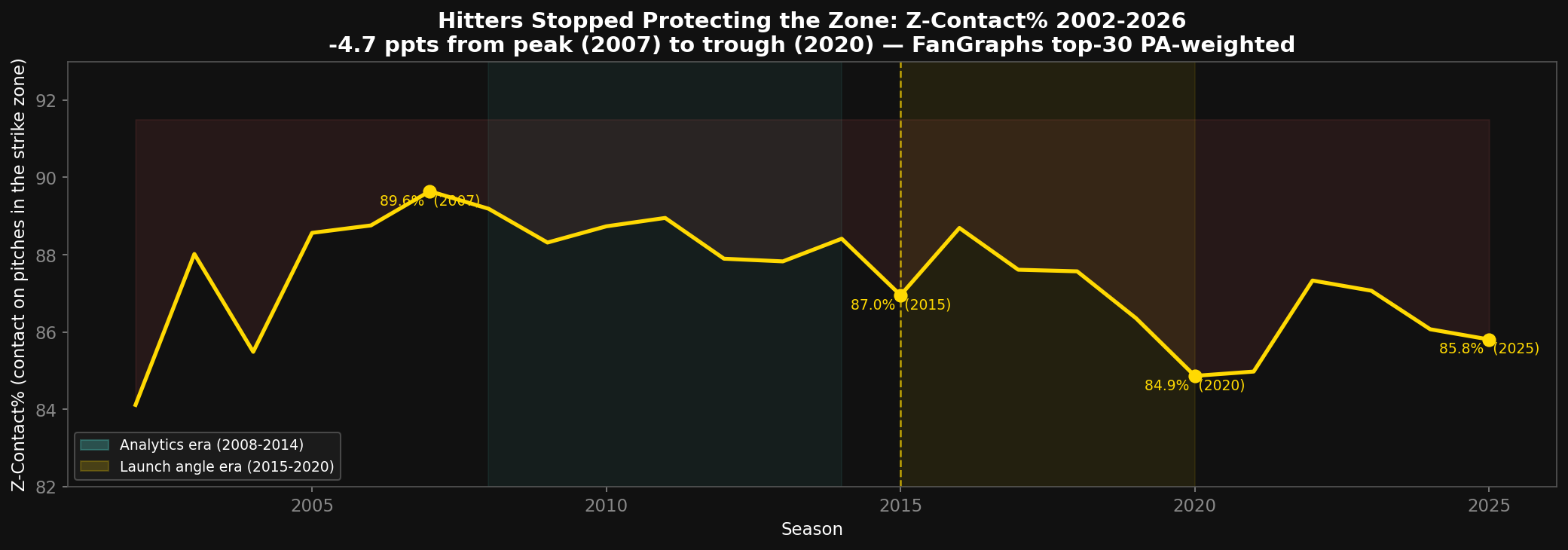
Contact rate on pitches in the strike zone (Z-Contact%). The 4.7-point drop from 2007 to 2020 reflects hitters maintaining full swing mechanics rather than protecting the plate with two strikes. Source: FanGraphs top-30 batters, PA-weighted.
There's a counterintuitive footnote worth acknowledging: K% has been declining since 2021, from 26.4% to 24.8%. The shift ban gave contact-oriented hitters ground to put balls in play again; some organizations quietly started recalibrating the two-strike approach. The "never compromise your swing" orthodoxy is softening. We'll see if it holds.
So Was the Launch Angle Revolution Wrong?
Not exactly. And here's where honest analysis gets nuanced.
At the individual player level, fly ball rate does matter. When we looked at 325 qualified batter-seasons (FanGraphs top-30 hitters, 2015–2026), both K% and FB% showed significant negative relationships with batting average:
- Individual K% vs BA: r = −0.407 (p < 0.0001)
- Individual FB% vs BA: r = −0.367 (p < 0.0001)
The players who get hurt worst are the ones doing both: elevated fly ball rates and elevated strikeout rates simultaneously.
| Quadrant | Avg Batting Average |
|---|---|
| Low K%, Low FB% | .306 |
| High K%, Low FB% | .286 |
| Low K%, High FB% | .290 |
| High K%, High FB% | .276 |
The 30-point gap between best and worst quadrant is real. Hitters chasing elevation are not wrong — they're just accepting the full cost of the tradeoff.
The reason FB% disappears at the league level is subtle: the fly ball rate among elite hitters hasn't actually changed that much — 37–39% in 2002, 40–41% now, a 2–3 point shift. The K% trend, by contrast, has been relentless: up for three consecutive decades.
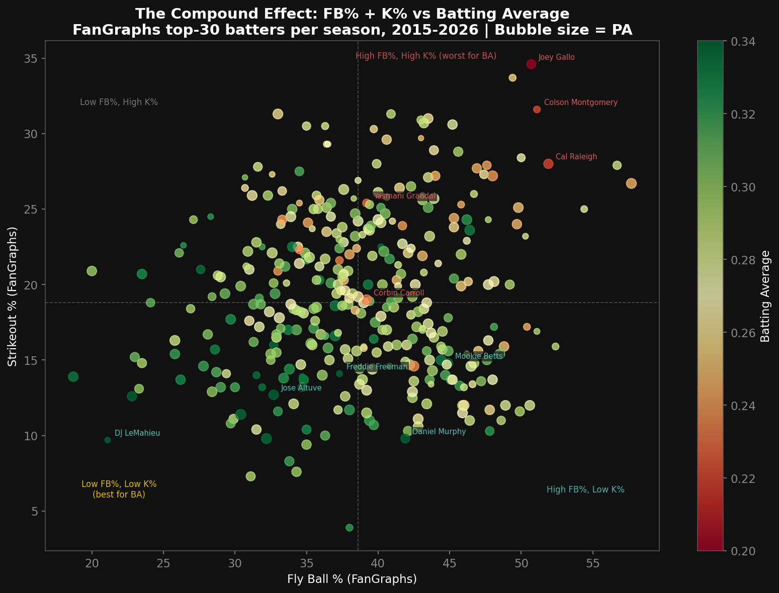
Individual FanGraphs top-30 hitters, 2015–2026. Color = batting average (green = high, red = low). The worst BA outcomes cluster in the high-K%/high-FB% quadrant. Bubble size = plate appearances.
Are Pitchers Getting Better?
Yes. And this matters more than most analysts acknowledge.
Average MLB fastball velocity went from 91.2 mph in 2008 to 94.0 mph in 2024 — a 2.8 mph gain in 16 years. That sounds modest. It is not. At the major league level, 2–3 mph on a fastball is the difference between a hittable pitch and a called strike on a pitch you thought you were going to crush.
The velocity–K% correlation is r = 0.852. The velocity–BA correlation is r = −0.880. Pitchers getting harder doesn't just raise K% — it independently explains a massive share of the batting average decline.
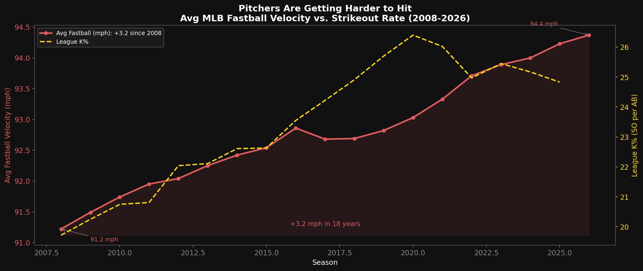
Average MLB four-seam fastball velocity (red) rising in lockstep with strikeout rate (gold). +2.8 mph since 2008. Source: Baseball Savant Pitch Arsenals — full pitcher population.
K% is the mechanism by which both pitcher quality and hitter approach affect batting average. Harder pitching generates more strikeouts. Fly-ball-oriented hitters accept more strikeouts as the cost of chasing barrels. Both inputs feed the same pipeline, and batting average is what comes out the other end.
This is not a story about one villain. It's a reinforcing loop:
- Pitchers throw harder
- Hitters get beaten more often on velocity they can't catch up to
- Hitters respond by hunting elite pitches to elevate — and not protecting with two strikes
- That means accepting more strikeouts on pitches they're not hunting
- League K% rises; league BA falls
- Front offices double down on velocity, because it works
- Go to step 1
2026 Midseason Watch List
We're far enough into the 2026 season — nearing the All-Star break, with most qualified hitters at 300+ PA — to check which players are leaning hardest into the elevate-and-accept-strikeouts approach this report has been studying, and what it's costing or earning them so far.
One limitation up front: this section samples from the FanGraphs top-30 leaderboard by WAR, so it only ever shows currently-productive hitters. Two notable names are missing entirely — Mike Trout and Aaron Judge — and the reasons turn out to be different enough to separate out. We pulled both players' actual lines directly (bypassing the top-30 cap) to check why:
- Judge looks like playing time, not performance. His wRC+ (148) is better than anyone currently on the top-30 list — but he's at only 261 PA against a ~330-340 PA average for the group, a gap that lines up with the multi-week absence he's been dealing with. Scaled to a full-PA pace, his WAR would put him comfortably back inside the top-30.
- Trout's case looks more like real performance. His PA (335) is right in line with the field, so playing time isn't the explanation. He's just outside the cutoff (WAR 2.42 vs. a 2.44 cutoff — essentially a coin flip), weighed down by a .234 batting average that his power and walk rate (wRC+ 139) only partly offset.
Among the hitters who are on the leaderboard, the "more strikeouts + more fly balls" approach is mostly paying off, not punishing:
- Elly De La Cruz — FB% up 4.3 points over his career baseline (32.1% → 36.4%), and BA has climbed to .273 vs. .261 career (+.011). The power-for-contact trade is working.
- Byron Buxton — the biggest fly-ball spike in the sample (47.4% → 54.4%, +7.0 pts), yet BA is up to .276 vs. a .264 career mark (+.011).
- Kyle Schwarber — the biggest K% spike in the sample (27.2% → 33.7%, +6.5 pts) alongside a smaller FB% bump, and BA is still up 16 points over his career baseline (.240 → .256).
The one real decliner doesn't fit the pattern we're testing for: Cody Bellinger's BA has fallen the most of anyone in the sample (.294 career → .264, −.030) — but his strikeout rate is actually down 1.8 points, and his fly ball rate is only modestly elevated. Whatever is driving his slide, it isn't the elevate-and-accept-strikeouts tradeoff this section is built to catch.
The midpoint takeaway: among hitters good enough to stay on an elite leaderboard, leaning further into fly balls and strikeouts hasn't broadly cost them batting average this season — talent and health are doing more to determine outcomes than approach alone. We'll check back later in the year to see if that holds.
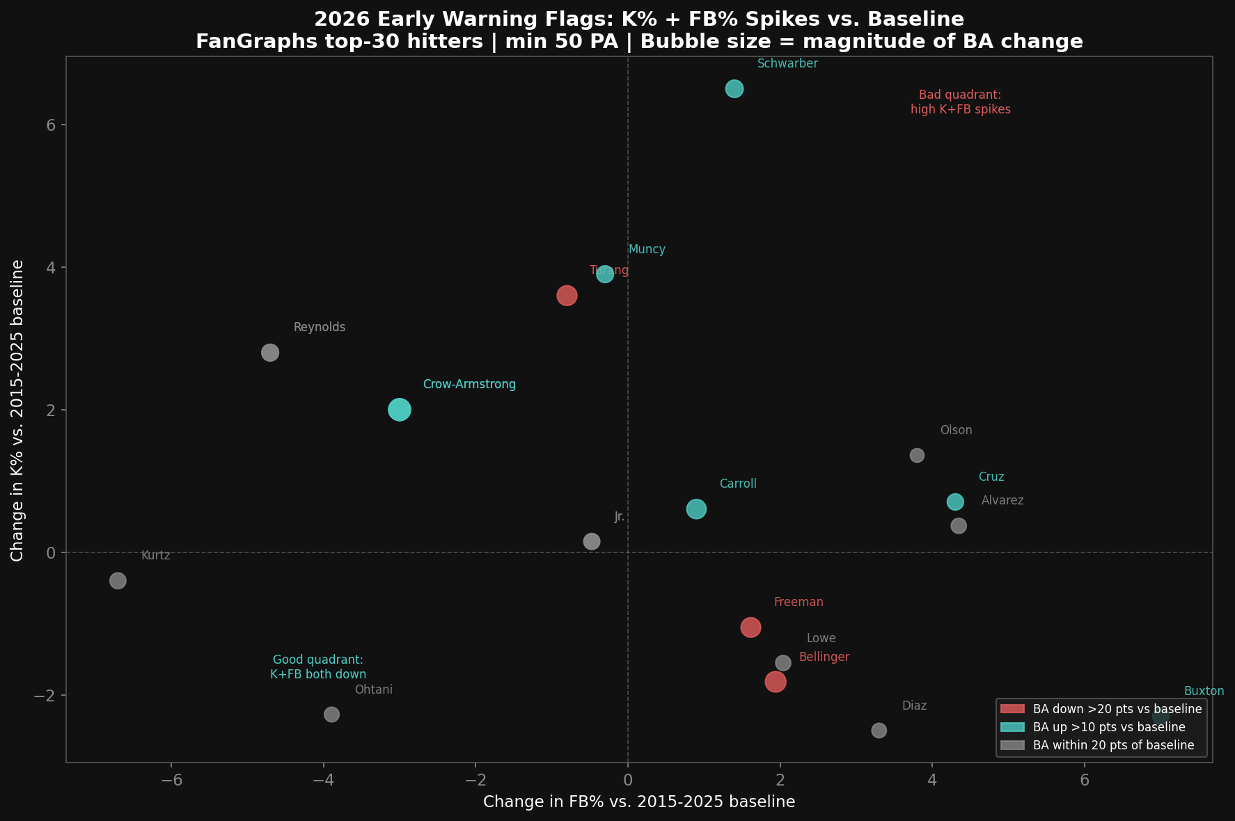
FanGraphs top-30 hitters, at the mid-point of the2026 season. Players in the upper-right quadrant (both K% and FB% spiking above baseline) are the ones to watch. Bubble size = magnitude of BA change vs. baseline.
The Bottom Line
The launch angle revolution didn't kill batting average. Strikeouts killed batting average.
The fly ball revolution contributed by creating a generation of hitters who are actively willing to trade contact for elevation — which means accepting more strikeouts on pitches they can't lift. That choice is rational at the individual level when power production compensates. At the league level, when everyone makes the same tradeoff simultaneously, batting averages converge on their current historic lows.
The pitching side is equally culpable. You can't look at the strikeout explosion and ignore the fact that fastball velocity has climbed 2.8 mph since 2008. Every tenth of a mile per hour is another fraction of a second hitters don't have.
The era of .300 batting averages isn't coming back unless one of two things changes: pitchers stop getting faster, or hitters collectively decide that contact is worth more than launch angle. There is currently no financial incentive for either.
Data: Lahman Database (1871–2025) · FanGraphs Leaderboards (2002–2026) · Baseball Savant Pitch Arsenals (2008–2026)
Analysis: Stinger Baseball Analytics · Stinger Collectibles — The Hive
Methodology: Multiple regression on 24 league-seasons (2002–2026); individual analysis on 325 qualified batter-seasons (FanGraphs top-30 per year, PA-weighted). Plate discipline (SwStr%, Z-Contact%) from FanGraphs type-5 endpoint, top-30 hitters per season. FanGraphs data reflects elite hitters — league-wide trends may differ in magnitude. Lahman K%/BA figures are full MLB population.